Visualization
Attack Flow offers several tools for visualizing sequences of behaviors. The Attack Flow Builder is a great option, offers easy navigation of large flows, and exports to PNG format.
ATT&CK Navigator
With this visualization, you can visualize an Attack Flow drawn on top of an ATT&CK Navigator matrix. First, choose a Navigator base layer or supply your own. Then upload an Attack Flow. Finally, preview and download the resulting visualization.
Try out the Navigator Visualization

Tactic Table
With this visualization, you can generate a tactic table automatically from an Attack Flow. The tactic table is inspired by the format that CISA uses in their cybersecurity advisories. (See example here.)
Try out the Tactic Table Visualization
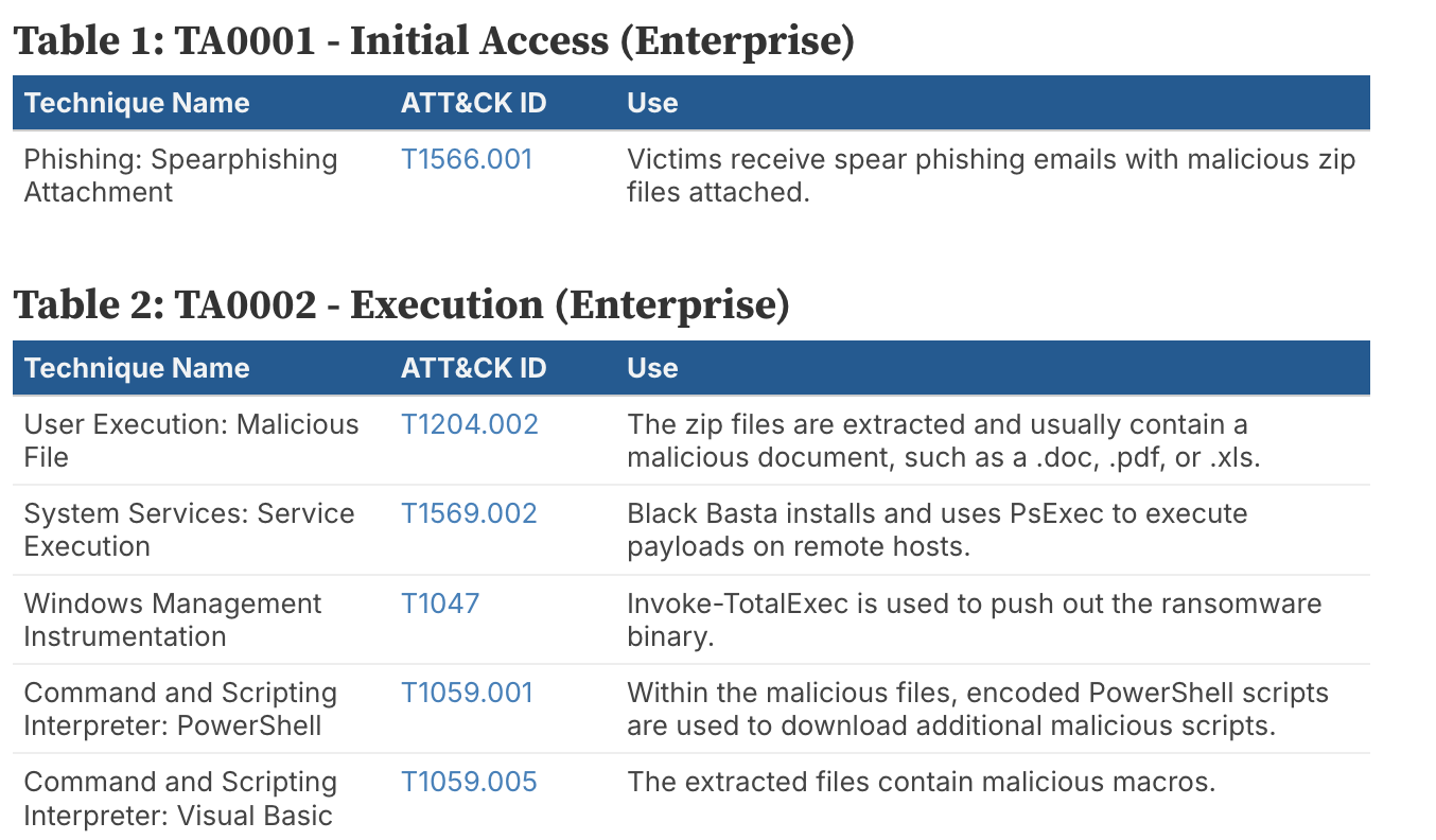
An example Tactic Table
Matrix View
With this visualization, you can automatically generate an ATT&CK Matrix comprised of nodes from an uploaded ATT&CK
Try out the Matrix View Visualization

Timeline View
On this page, you can generate a timeline visualization automatically from an Attack Flow. The timeline is inspired by examples of timelines used in cyber threat reporting in the wild.
Try out the Timeline View Visualization

Treemap View
On this page, you can visualize the distribution of techniques across multiple Attack Flows. The data is visualized in a Tree Map, where each technique present in a Flow has its own box, grouped by tactic. The size of each technique’s box in the tree map is proportional to the number of times that technique appeared in the uploaded Flows. The color of each technique’s box is related to the technique’s score from the uploaded Navigator layer. Or, if you don’t upload a Navigator layer, the colors will be determined by tactics.
Try out the Treemap Visualization
